As a web consultant, I had to transform an idea into a high-fidelity prototype.
When researchers want to publish their work, they have to research multiple online resources to compare and aggregate different results manually to make their decision.
A web search engine that allows swiss researchers to access all publication’s conditions in one place.
Live demo: https://oacct-test.epfl.ch/#/
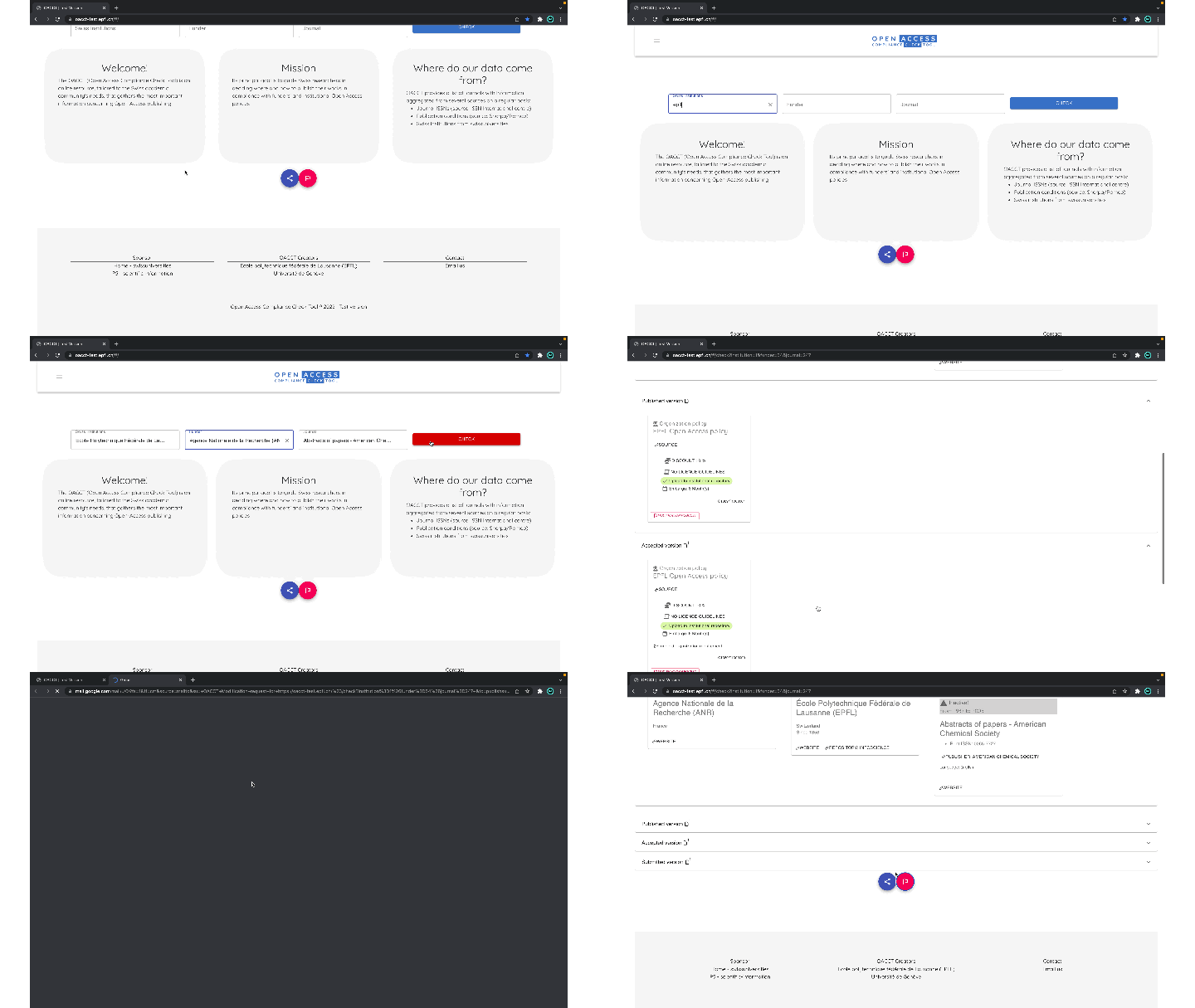
Last October, the client presented the project during the International Access Week.
Open access (OA) is a set of principles and practices through which research outputs are distributed online.
Main responsabilities :
The internal team had already collected quality data using interviews and surveys. They transformed those data into twenty users’ stories.
My first challenge was understanding the business need (I had no experience in the scientific field).
How they think and how their work. I did several interviews onsite with the project team to understand their way of working beyond the project.
I collected a lot of information which was useful but overwhelming at the same time.
My first question was how can we synchronize our expectations to not get lost in the process?
I had to find a common way of communicating the result of the design to the team and validating the technical implementation simultaneously.
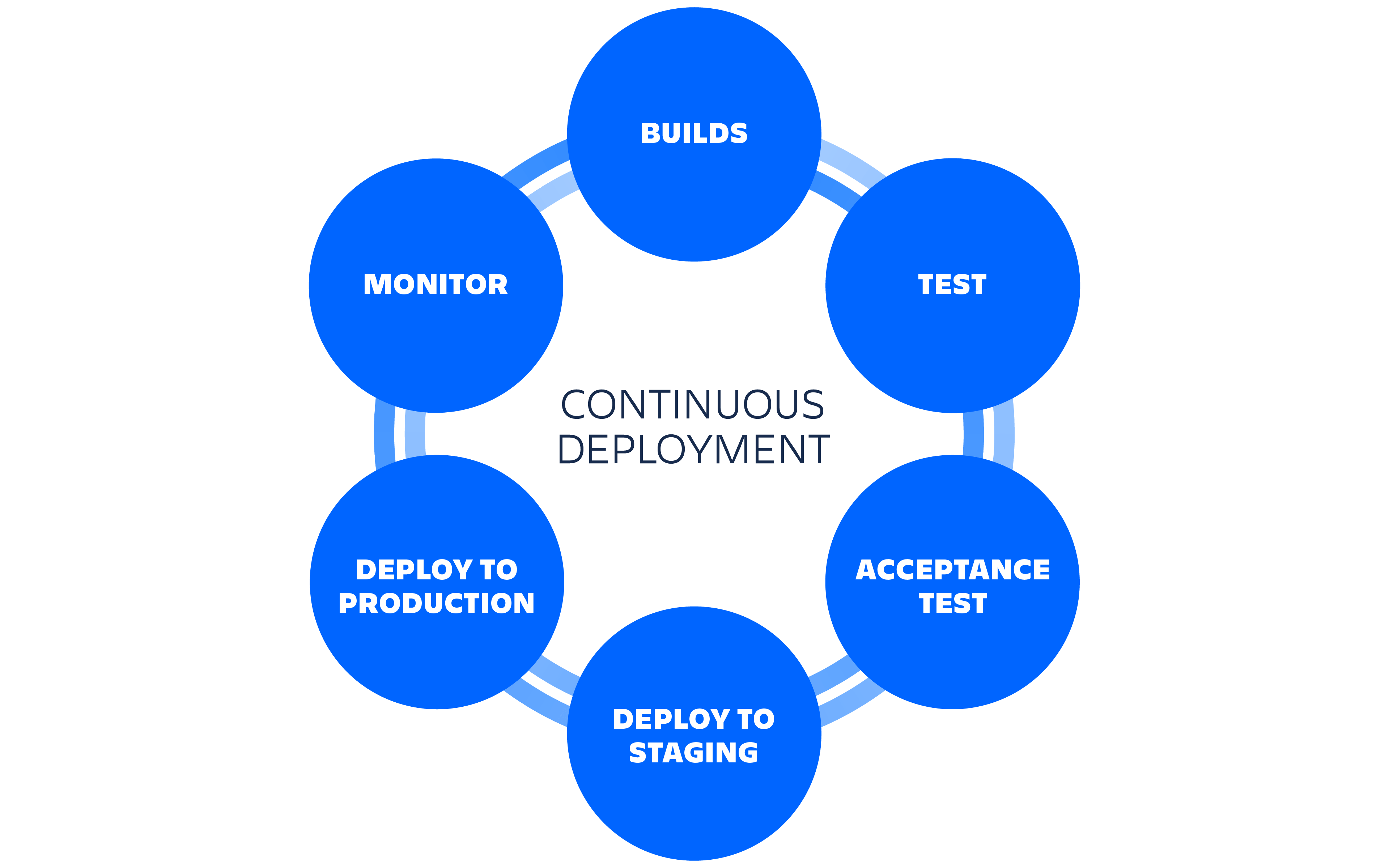
I decided to go live as soon as possible. So we published the application online early on with a continuous deployment cycle.
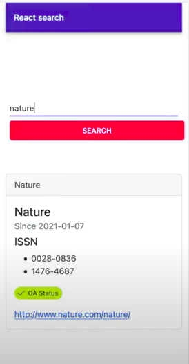
I first sketched some drafts on my own, inspired by a google search interface.
I configured and connected the backend API to the frontend. Then, I added some fake data to display.
Finally, I transformed my sketch into a React user interface.

From that first simple Version, we were able to:
✅ Validate the application architecture using the client’s infrastructure.
✅ Speed up the design test process.
✅ Share the live progress with a public URL.
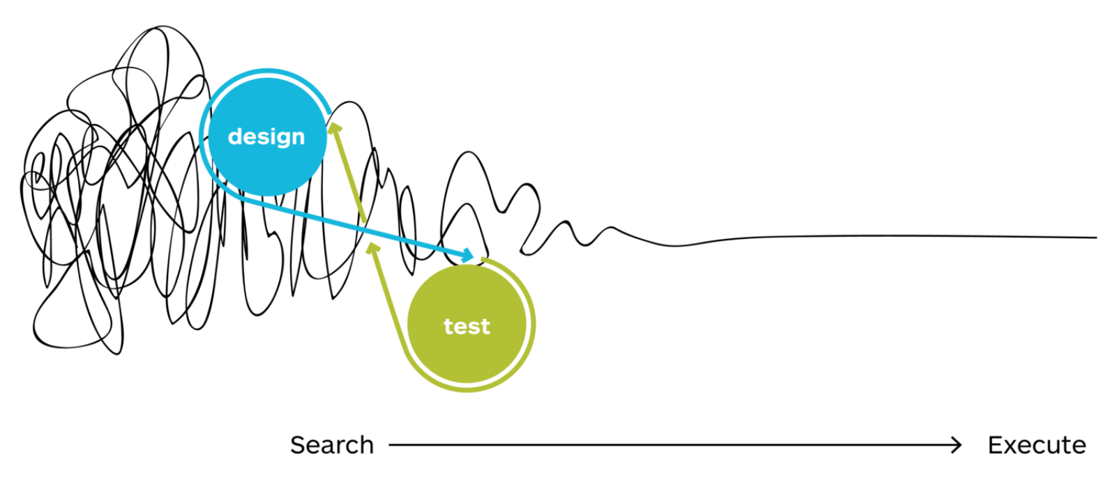
I didn’t know how to design the search field, so I decided to go back to my sketch and focus on user expectations.
Then I searched for best practices for the search interface and used material UI for React, which handled my common design principles. Nonetheless, I found that drop-down has some cons to be aware of :
- They’re subject to overstuffing and can be cumbersome to scroll through when they contain too many options.
- They slow users down when they’re used to capture readily known values. For example, when entering a birthdate or credit-card expiration date, typing in a form field is usually faster and easier than interacting with dropdown lists.
- Discreet: Because they are so compact, users may accidentally overlook dropdown lists in forms, web pages, and applications.
- Easy to dismiss: Accidentally deviating the cursor from the box closes the dropdown and people have to start the selection process all over again.
Next, I went back to the team with more questions about the data we didn’t have.
- How many items per search field?
- Are the names in English, French, German or Italian? (Swiss speciality🤯)
So for the first question, it was not more than 10 for each field and English only.
From that, I created a quick prototype in Adobe XD to share with the team what I understood on my side.
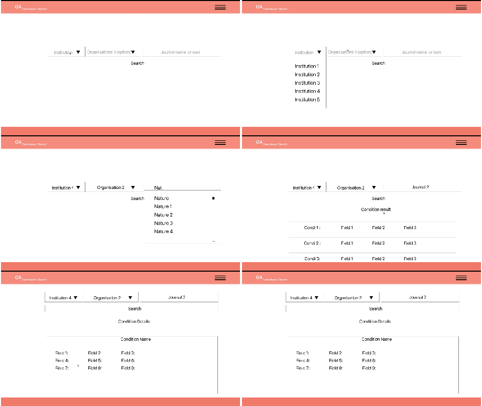
I designed the search engine that matched the user stories and iterated at each review based on their feedback.
After eight months of weekly iterations, we integrated all the must-have features based on the initial user stories.
🎁🎁 Added two bonus features that allow the internal team to share the result with colleagues and report mistakes.
Being able to publish 10+ versions every week and share them directly with non-technical teammates was an efficient way to get direct feedback and fix it straight away.
Live demo: https://oacct-test.epfl.ch/#/

Don’t be afraid to publish something that is not finish!
Don’t be afraid to publish something that is not finish!
A significant milestone was to convince the team (myself included) that we needed to publish the first Version online early. Without that, we couldn’t understand and solve multiple issues on days together as a team. An excellent method to synchronize expectations across different roles!
Set deadlines⏰. It is a powerful tool to prioritize and get the most important painpoint fixed in no time! 🚀🚀🚀
Set deadlines⏰. It is a powerful tool to prioritize and get the most important painpoint fixed in no time! 🚀🚀🚀